A while back, I wanted to blog again. I opened the repository of my blog, wrote a little bit, and hated every part of it.
You see, I’m a human being with subjective thoughts, feelings, and opinions. I can set these aside when doing regular work, but when I work on my own projects, it’s subjectivity galore. This can be great, because I get to do whatever I want, but also leaves me susceptible to dislike things for the randomest of reasons.
Do you know that feeling where you’re appalled by code you wrote a while back? That’s how I felt about my own blog. But not just the tech stack. The design, too! It’s so… blue (da ba dee dabba da).
Let me walk you through the changes and my rationale behind these choices.
Tech
In 2020, I set my blog up with Eleventy, a fantastic static site generator built by the equally fantastic Zach Leatherman. It was refreshing and amazing because things just worked. It was vastly superior to anything I had used before, and I’ve used a lot. I’ve used WordPress, Hugo, Hexo, Jekyll, I even developed my own minimalistic static site generator, but Eleventy was the best.
A couple of years later, in 2022, I developed ijsjes.dev — a poorly designed JavaScript blog that is in a constant state of revival. For that blog, I used Astro, and I was stoked. I’ve been using Astro for nearly every sideproject ever since.
With Astro being my favourite tool, every time I opened my website, I felt a bit let down seeing Eleventy. Don’t get me wrong: Eleventy is still great and in no way less than Astro. My dumb preferences are just getting in my way.
Once I started rebuilding my website to Astro, how can I possibly ignore the design? Yup, the design had to go, too.
The design: all about content
Although I’ve grown to dislike the colour theme, the previous design is actually very good.
It’s deliberately very minimalistic in nature. I wanted it to be primarily about content and you’ll find that there are no distractions. No information about me, what I do, related blog posts, or other irrelevant nonsense. It’s just blog posts, surrounded with very subtle links to other content.
My issue wasn’t so much with the design, it was with the theme.
The unbrand
I love personal branding like Josh Comeau’s slick palette and avatar or the clean and professional look of Sara Soueidan’s site while adding some personality with these cute bird illustrations.
However, I deliberately avoid developing a personal brand. I don’t have a big audience, and don’t care about getting one — I prefer qualitative interactions over quantitative. My job and online presence rarely interact. The latter, as one might expect, is only glossed over when I’m applying for a job. It doesn’t matter if my presence is cohesive or consistent.
Branding, personal or not, is all about recognition, so cohesion and consistency is of vital importance. It’s about trust and turning interactions (e.g. purchases) into recurring ones. But I don’t want you to return to this blog because I have a cute avatar and a colour theme to trigger associations — I want you here because of the content. I don’t want you to recognize me, I want you to recognize good content.
Not concerning myself with a brand saves me time and headaches. Frankly, I’m a terrible designer and don’t care enough about it to hire someone to develop a brand for me. More importantly, it feels liberating! I get to break rules: I can whip out a new theme on a whim. It doesn’t have to meet any standards, either! The quickest thing I can conjure is a basic greyscale theme where links still have their vanilla blue colours. That’s good enough, and something I can and will ship.
A personal touch 
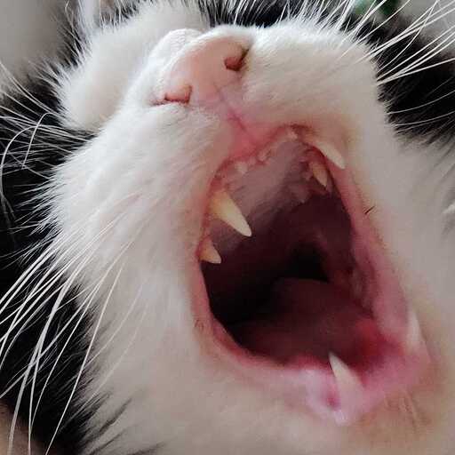
Despite being unbranded, I do want to add a personal touch. In a previous restyle adventure I did in Figma, the concept started with “I like space photography”, which quickly turned into a generic Linear-esque dark blue and purple-themed site that we’re seeing too much of lately. The reception of the first draft was positive among friends. On that first draft, the logo was just a picture, and someone suggested replacing it with a Fronteers Slack community meme: my cat yawning, which ended up as a custom Slack emoji. I ditched the rest of the design because it was too slick for my taste, but the idea of swapping the logo with a bunch of random pictures and emojis of things that I like, stuck.
What started as a joke became a way to express personality subtly. It’s a bit odd, not unlike myself, and adds just the personal touch I wanted.
Type
Thanks to the absence of a personal brand, I can let go of the notion that type has to be consistent or fit the brand. Because of that, I went from Source Sans Pro to whatever Transitional serif is installed on the visitor’s platform.
I just copied the modernfontstacks.com stack that I found easiest to the eyes when reading a couple of paragraphs, which is Transitional serifs for me. Although I assume the stacks are based on similarity, rather than legibility within a specific style, I’m okay with finding that out the hard way. After all, I can change things on a whim.
I might end up adding components to customize the reading experience, similar to how an e-reader lets you adjust the type, size, and spacing. We’ll see.
Will I blog more?
Maybe? Similarly to my other hobbies, the motivation for blogging comes and goes. I appear to cycle between blogging, gaming, working on side projects (that I hope to monetize but never release), and face-to-face time with family and friends.
I do hope this rebuild and restyle eliminates one of the barriers, though. Although turning a blob of thoughts into a cohesive article is the biggest challenge for me, perhaps lowering other barriers — actual or imaginary — makes enough of a difference to make me publish more often. We’ll see!