Historically, Apple’s design language has inspired many web designers and we’ve had our fair share of Apple-esque trends. So with the introduction of glassmorphism Liquid Glass in macOS Tahoe and everyOS 26, I expect another surge in glassmorphism and faux refraction.
I am a fan of prioritising content over controls, which Liquid Glass and glassmorphism achieve trough transparency. It “adapts” to content and it’s soft — red background makes controls red-ish, blue background makes controls blue-ish. It’s low-contrast and dynamic by design.
Unfortunately, a majority of the human population don’t have perfect vision. Not everyone has access to contact lenses or glasses. Not everyone has them on all the time. Not everyone sees the full range of colour. Sufficient colour contrast helps make things clear for everyone. A design trend that is inherently low-contrast is going to cause issues for a significant, if not a majority of people.
Examples of buttons in which the text contrast is sufficient in many cases, but not all.
So, at the very least, test the worst case scenarios. Place your control on a background that minimises contrast and then test whether it passes WCAG SC 1.4.3 Contrast (Minimum) and SC 1.4.11 Non-text Contrast.
Examples where the button background was adjusted so that the text contrast is sufficient in the worst-case scenario, making the colour contrast sufficient in all scenarios.
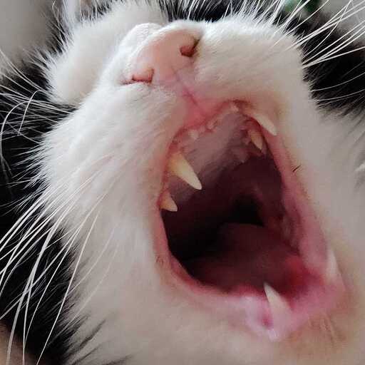
Let’s look at a real-world example: YouTube. They recently replaced the controls bar with standalone buttons that have translucent backgrounds. The button content is always white. As for the backgrounds, these can be literally anything, but videos that are white around the edges isn’t uncommon. MinitePhysics comes to mind.
The icon buttons fall under success criterion 1.4.11, where the minimum required contrast is lower. The thin shadows around the icons could be considered borders (see Note 5 on contrast ratio), which we may consider our background and increases contrast just a tad bit. All-in-all, this makes the contrast sufficient.
In contrast (ha!), the overlays with text doesn’t meet the requirements. With my glasses on, screen brightness maxed out, and without other limitations, I can still barely read this.
For the controls above, the worst case scenario is small, extra subtle text on a white background. I don’t know what the accessibility goals at YouTube are, but I’d say this wasn’t tested thoroughly.
So, please do humanity a favour and apply glassmorphism responsibly: test and fix your worst case scenarios.